


G1en
-
Posts
880 -
Joined
-
Last visited
Content Type
Profiles
Forums
Events
Gallery
Store
Everything posted by G1en
-
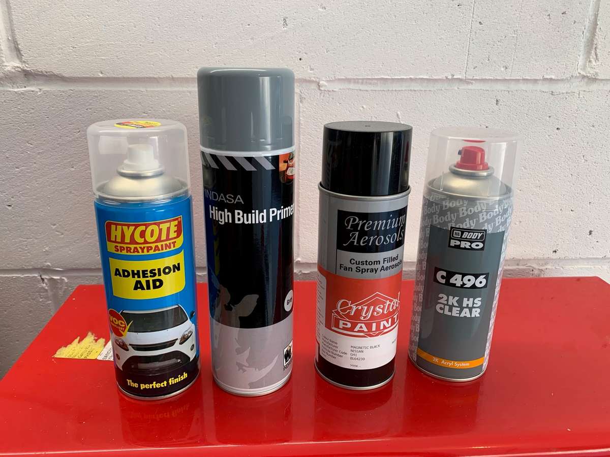
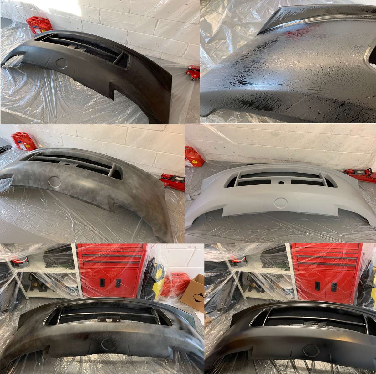
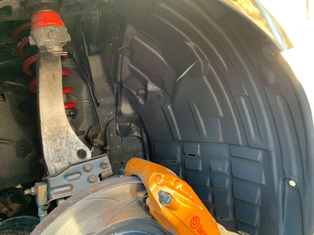
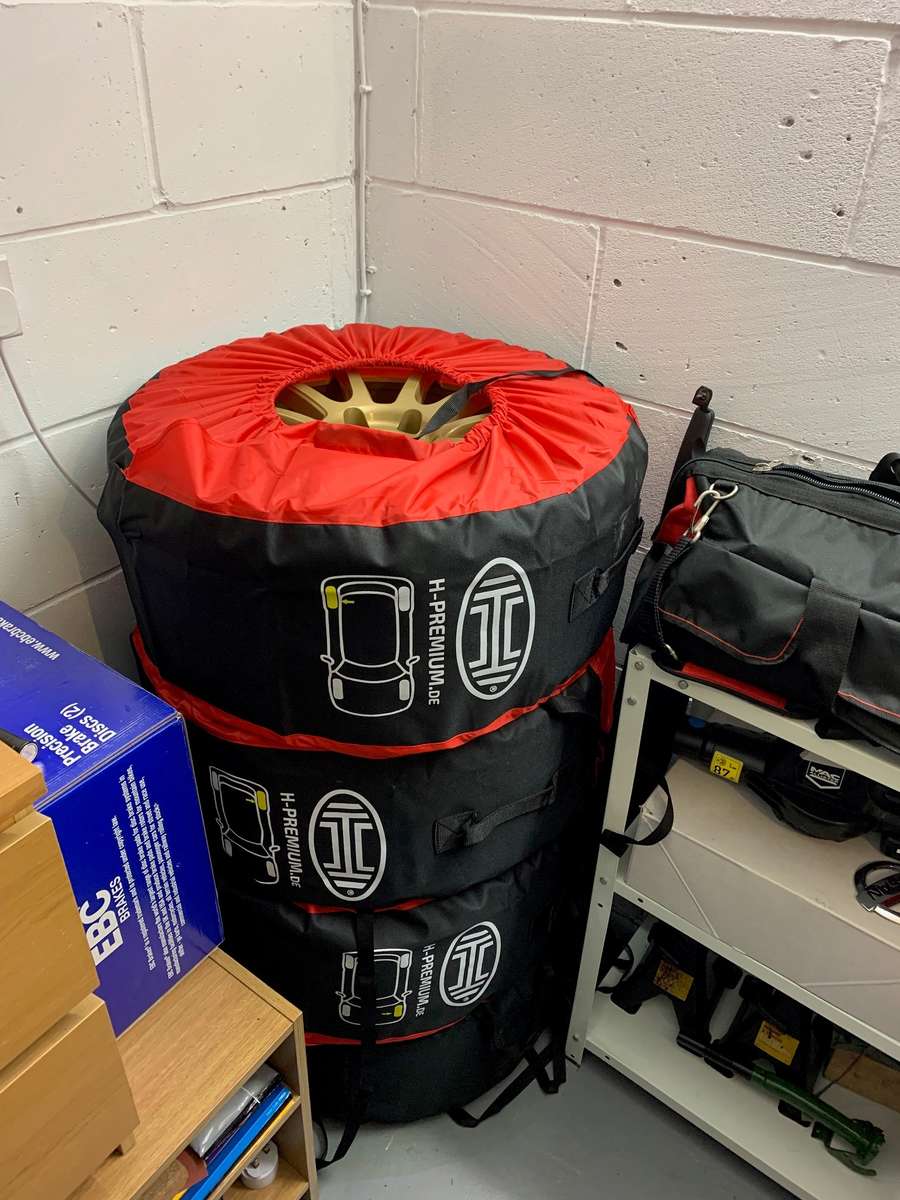
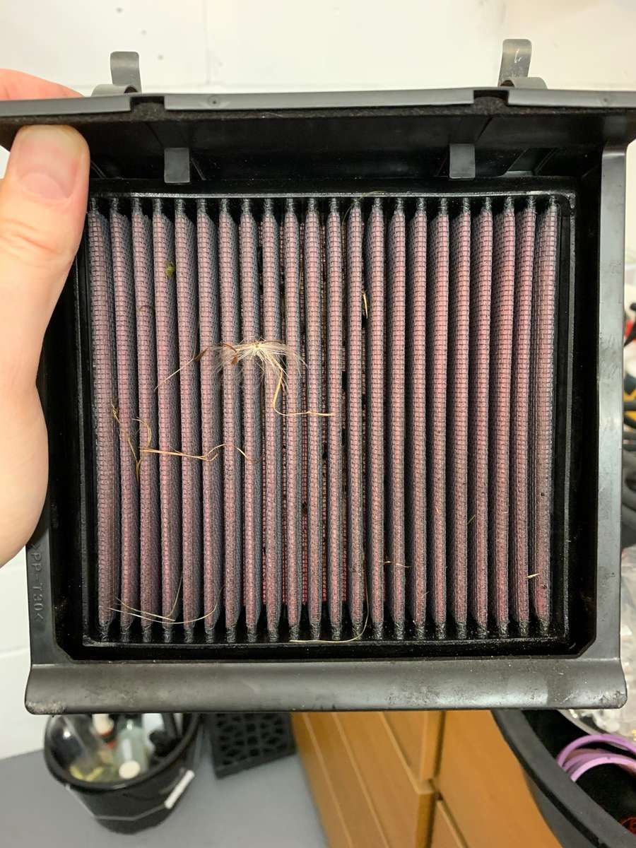
Continued.... After spending most of last year with a bare polyurethane bumper I decided to get round to giving it a lick of paint. The original plan was to either get it professionally sprayed or wrapped but with both options costing around £250-£300 I plumped for me having a go with rattle cans at a cost of £50 all in, so here was the line-up: Now I will be up front and say the final outcome is not that great. The orange peel is more like a Spanish orchard of naranjas BUT from afar, and by afar I imply something like 200mtrs you cant tell. In hindsight, I should of wet sanded the clearcoat, before that I should not skimped on the main colour and bought 3 cans instead of 2 and I have no idea how long it will even stay on the bumper anyway as many internet threads worn of the perils of painting polyurethane, even the paint shop and a vehicle paint repair man who was in at the same time as me had different views as to what you do/don't do or need. So with that and me confused as hell, I purchased some cans and thought to myself, even if it turns out terrible, its only a bumper and can be re-done or wrapped later on. Below you will see the 6 stages from top left to bottom right. Firstly I had already cleaned the bumper before sanding with 400/800 grit sandpaper and wiping clean with panel wipe and painters wipes. Next I sprayed the adhesion aid, this didn't stick and cover as I expected, I'm not sure you should use it or not but some places say to so I did, because it kind of run, I smeared it across the surface with a cloth and let it become tacky before applying another coat and doing the same. Maybe I didn't clean/degrease/sand properly to start with, maybe its the wrong product, I havn't got a scooby. All I knew was I was carrying on regardless. Next I sprayed the high build primer (again, I asked for a plastic primer and got told at the shop this was best) It seemed to go on great and the adhesion promotor definitely must have helped. Next was the base colour, I had it mixed to the car colour, I sprayed 2 coats as I had 2 cans and because its a large bumper it took almost a can per coat. This just isn't enough really as you can tell in the odd spot at the finish where you can see there is barely and black paint in areas. The other problem with spray cans is because I was mainly spraying downwards, every now and then I would get a drop of paint fall off the nozzle and onto the bumper making a blob here and there. I tried to wipe one off with my finger only to find it took the whole paint off back to primer so quickly realised I would just have to live with it or spend hours refining the finish afterwards. Final stage was 2 coats of 2k clearcoat. Now 2k is, I am told, a chemical resistant clearcoat like normally found on your car and is resistant to petrol/oils, "normal" clearcoat is not, its all a learning curve. I let that dry and then weeped at the results. I decided to push ahead and ""protect" my work of sh**e I used some old polish I had in the garage, some scholl deep cut, then general cut/finish grade to try and flat out the orange peel but it didn't it, it just served to enhance the shininess of the turd I had created, Anyways I could just not be bothered with wet sanding or starting again so my intention was to coat the bumper with Gtechniq EXO I had left from doing the car but as soon as I tried panel wiping the finish to get the polish remnents off it made all the paint go really weird. it was like I was scratching the finish and creating marks and dull spots so I quickly stopped and got the cutting polish back out which got the finish back to the shiny turd. I changed approach and grabbed something else I had in the garage instead, some ptfe polish followed by hydro-coat from carchem, This went on fine and ggive the very thin paint another layer of protection. So, What have we learnt? 1- Part of what you are paying for professionally is the "expertise" and right equipment to do a great job 2- If you attempt something like this, make sure you do several weeks training on your index finger as by the end I couldn't even press the nozzle down 3- Polyurethane may or may not be harder than other materials? I don't know 4- I will probably have to pay someone to sort it later this year anyway as either A- The paint will flake off or B- I will crash and take the paint off Anyway, onto some easier tasks, I had not had a right front arch liner for a while after my wheel decided to chew the original one up so whilst the car was off the road I purchased a cheap replica off ebay. Now normally I would not recommend buying cheap Chinese tat but at around £25 I though it was worth a punt. It came rolled up in a tube, not great I thought, but after opening it sprung into some sort of shape and because its a much more plyable type of plastic than the OEM one, you can bend and shape it really easily. I had a big shock when I put it in the arch and it fit perfectly with all the holes lining up for the clips, RESULT for once: Next, after stating in last post, I had not checked my K&N filters for 3 years I thought I best do, turns out they are still very clean, just a little shrubbery stuck in them from grassy excursions but much better than expected, They are good for at least another year or two. Finally, anyone that has transported wheels and tyres in their car will know its a pain and can be messy so I plumped for some wheel covers which will keep the wheels dry/clean/safe and look the part too. They even indicate which wheel on the car it is so should prevent any errors when swapping wheels in a rush on track. Before I put the wheels to bed I gave the front two a clean and re-coated with gtechniq C5 as after changing the brake fluid last year some spilt onto the inner drums eating into the finish and staining them so that was 95% sorted now and re-protected for the next "incident" Harewood Practice day coming this month, then 3 championship rounds booked, JPS show at Coventry booked for August. Onwards and upwards....
- 269 replies
-
- 2
-

-
- waxandshine
- hillclimb
- (and 2 more)
-
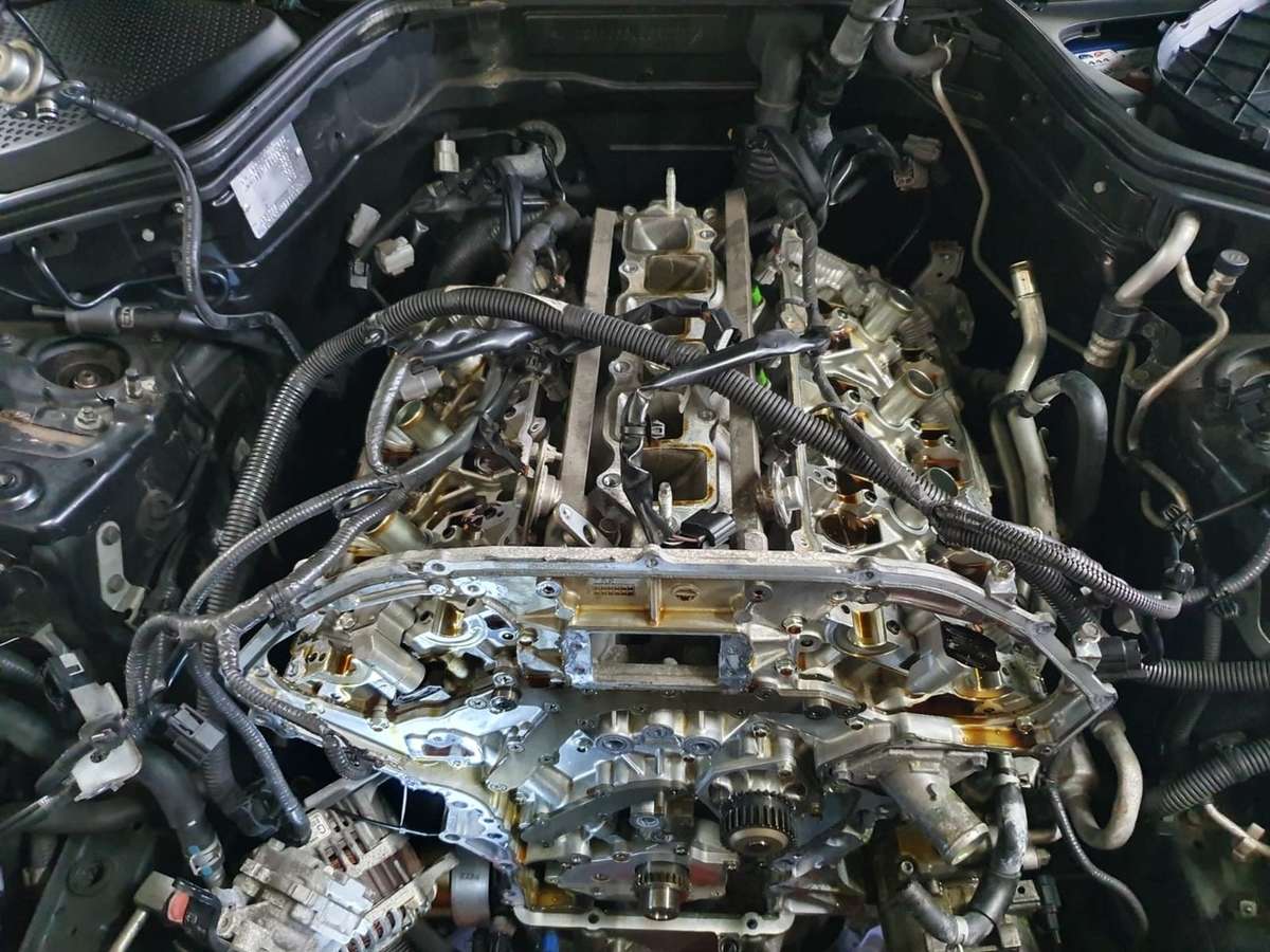
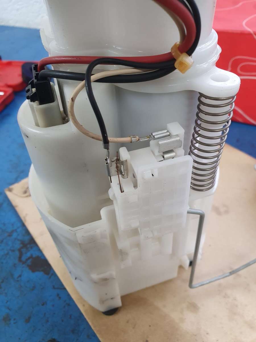
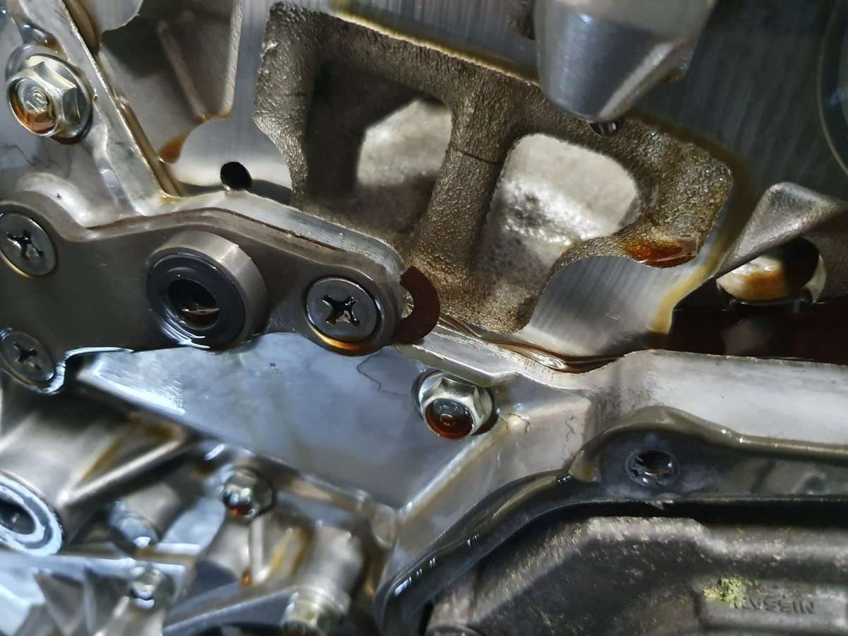
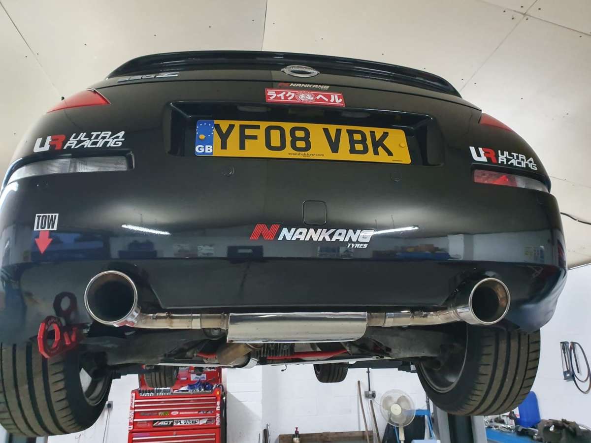
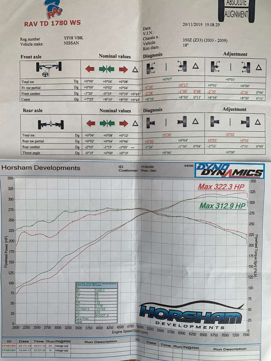
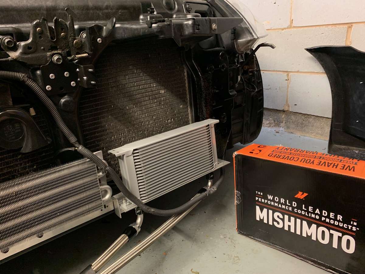
Right, lets bring this upto date a little. So with the hillclimb season over it was time to see what I could spend some money on to get the car a step forward. All cosmetic enhancements went out of the window a while back so it was only functional upgrades from now. With the car handling about as good as it can get (well sort of, more on that later) the obvious other major consideration is power so still not having the budget or desire/worry for turbos I decided to put some high lift cams in so booked in at @Jez @ H-Dev in November. I smartly booked the MOT for the week before as apparently sport/race cams can make it very hard to pass an MOT, needless to say it did get through although one of the readings, can't remember which, was right on the limit for pass/fail which is probably to do with the cobra sports cats possibly degrading. So off I popped for the 200 miles to Horham and dropped off the car Tuesday and arranged to collect Friday. Now the list of Jobs I left them with was quite extensive and not known to me at the time was about to get even bigger. Many of you will know one of the very few flaws on the 350z HR motor is the dread oil gallery gaskets, so even though I have never had any issues with the oil pressure and the car is on around 70k it only seemed right that whilst the engine was apart, we may as well get the gaskets replaced with the uprated version for peace of mind, it also makes financial sense as the cost is minimal if the engine is stripped already. The great thing with trusted garage such as Horsham Developments is the guys ring you with updates as they are going along especially if they hit any snags/issues. The gallery gaskets in the main were still ok, which is obviously why my pressure has been fine to date but Craig did say one part had broken loose and over time would have failed so like many HRs, they WILL need doing at some point even if you have an unblemished service record. This was mine below: I also decided to purchase an uprated fuel pump, even though not required because I wasn't going Forced induction, for peace of mind and to keep my credit card busy I insisted anyway as the existing pump was now almost 12 years old and after reading up on it, the oem pump is surprisingly small/low pressure, whatever the correct terminology is. I think (but don't quote me) the standard fuel pump is 90 l/min where as the uprated one Horsham offer is something like 210-250 l/min so again, it just means peace of mine and I am not gonna have a lack of fuel when thrashing it on track. So next on the build list was hardrace engine mounts, now for the last few months I have experienced a lot of juddering or wheel hopping when setting off that I put down to worn engine mounts or because most parts underneath were polybushed and I already had the hardrace gearbox mount, I assumed this was the last sloppy piece in the jigsaw, it was only when they got it up on the ramp that they told me the likely real cause. The front ultra racing strut brace (not the w brace) that I replaced last year had been hit/bent so many times (due to the car being so low, me going off track and bottoming out over humps/bumps) that 2 of the 6 fixing bolts had sheered off and the 2 banana arm poly bushes either side had been ripped out of the arms, this may well explain the progressive vaugeness in steering I had put down to wear and tear (turns out it was quite literally wear and tear) So added to the list of jobs was new banana arm poly bushes and a new front brace, OEM this time sourced speedily from @ZMANALEX as its much stronger and a full alignment required. I also asked them to raise the front coilovers as much as they could and lower the rear slightly. I had always been under the impression they were on the maximum height but it turns out they were kind of in the middle of the adjustment range so we were able to raise the front suspension around 20mm and lower the rear around 10mm which has made a big difference to front clearance for speed humps and now the car sits kind of level rather than raked lower to the front which should also help me get off the line as the centre of mass will move slightly rearwards (if you ever watch old rallying with the escorts you will notice the rear end is always squatted lower to the ground for traction) So, finally, all the routine yearly service tasks were carried out, new titan race oil, new coolant, new diff oil, and its was aligned to my request, the few bumps and scrapes over the year had knocked the alignment out slightly so its always best to get it done every year. we went for the maximum the camber arms would give us on the front (-2.5) It was -3 at some point in the past but raising the suspension means you take off camber, conversely, lowering a car adds camber, not teaching anyone to suck eggs. and -1.5 on the rear with neutral toe, as I have mentioned before, I find this is a good neutral setup for my driving style and having a square tyre setup eliminates a lot of the terrible understeer the standard car offers. Onto the dyno, now Horsham were disappointed with the results and they think a CAT may be degraded/blocking some of the exhaust gases, this may well be the case as it keeps throwing up the same EML light periodically which is O2 sensor 1 &2 Bank 1 but I don't have the time/money to sort the exhaust so that's something for future, it could also be the manifold but its not major as it did make 10bhp over last time which was 2 years ago. They did not have a start point as apparently with new cams you can't do a base run/before run as you need to download different things to ecu or it runs like a pig. so we are basing this against last dyno printout, previous in this build thread which as stated is 2 years ago, the car may have naturally lost some power since then, who know, I know I have never changed the K&N air filters so that may restrict the airflow, anyway, we still got an improvement at the top end which is where I need it for track driving and it seems obvious the Tomie cams are working as the power is still there/increasing at red line. Its hard to tell whether I will see any actual time improvements (watch this space) but the sound at WOT is proper race car now and amazing. shame I cannot de-cat the exhaust because of hillclimb regs (and general mot regs!) as it would sound even better and release even more power (another reason the gains had been low) all the cars previously dyno with high lift cams had been de-catted and uprated cold air intakes for breathing, so although slightly disappointed, I know I can certainly get more power down the line if I sort out the intake and exhaust. Coming next, I attempt to paint the front bumper plus other TLC jobs on the car.
- 269 replies
-
- 3
-
-
- waxandshine
- hillclimb
- (and 2 more)
-
1. 14N - 370Z - Yellow - **** 14N - PAID 2. RY4N - 350Z - Red - **** AAV - PAID 3. Ka.370z - Rose Black Convertible - ****KMZ - PAID 4. Valy - Black - ****LNO - PAID 5. AmyZed **** AMY - PAID 6. Silk - 350z Midnight Blue ******* - PAID 7. G1en - 350z - Battle scarred - ****VBK - Paid 8. 9. 10. 11. 12. 13. 14. 15. 16. 17. 18. added you on as well Shane, just update with part reg when you can.
-
We now have around 50 bags for life in the cupboard as the misses keeps forgetting to take them shopping but its all good as i am apparently saving the planet.
-
Well done Colin, get that page mounted on the garage wall.
-
Well done Andy. Top man
-
I have a pair if its the standard orange ones your after
-
Thats seems fine and i doubt it would be that exact to oem if any of the chassis or arms were bent so that just leaves tyres or bushes really. If you have had the bushes checked and they are fine than its back to the tyres. Unfortunately an expensive way to find out if it makes it better but if the current tyres are hardly worn you could sell them on. I take it its on standard suspension and not some chinese aftermarket tat that a previous owner may have put on. As mentioned above, has anyone else driven the car since alignment. Failing all that im out of suggestions.
-
Complete guess but could possibly be something like brake fluid or fuel thats splashed up from the wheel and sat there for a while so eaten slightly into the clearcoat? when i spilt a little brake fluid onto barrel of an alloy wheel and left it i was suprised how it went through the gtechniq C5 applied and made a similar thing to your pic.
-
I think if he sells the car he needs to add the line “wheels would benefit from a refurb”
-
Just to note and i am not suggesting this is the case but “they” can make any value of toe/camber/caster appear green on a printout by overriding the required values. For example my printout is green but camber is -2’30 which is not factory spec, it was just easier for guy to see on screen when altering rear arms then he tweaks it from there and the printout is all green. Nothing is in factory specs but it is green in relation to what i asked for. So worth just checking the after printout to make sure all is ok, also again, does anyone else drive the car as i know my wife could hit a pothole/kerb and never mention anything to me which could throw something out without you realising.
-
If the geo is ok, next logical step is tyres tyres tyres. A lot of people harp on about this but its the only thing connecting you to road, this time of year with slippy road surfaces will make the heavy zed feel lighter steering anyway but an A rated wet tyre will give you lots more sure footedness, just not great for the summer. I have just put uniroyal rainsport 5s on the daily peugeot 308 (front tyres only) and the ones on the rear are continentals still with loads of tread. I was flinging it around a few roundabouts in wet conditions and the back was sliding out which just should not happen in a front wheel drive front engined car but just goes to prove the extra grip of a well Renowned dedicated wet tyre over another “less capable” tyre going back to the alignment, a decent garage should be able to tell if its had a knock previous but the alignment would be a real chew to get correct if arms were bent etc to the point were either a “good” garage would explain the situation or a”bad” garage would just do what they can and take your money.
-
Great stuff just how “long” is this test planned to last for. I simply ask for the “elder statesmen” of the forum that sadly may not be with us to reach its conclusion and thus can decide whether to carry on Reading past this point.
-
Welcome. Even the inside of the exhaust is shiny. Great stuff
-
Yeah around 12mm but couple of things to note, if your going from worn out tyres to brand new you will gain half of that back with the new full 8mm tread and different tyre manufacturers can have varying widths/depths of tyre but quote the same size ie 245/40 size. But all in all, you will be fine
-
245/40 profile will be fine, thats what i have on mine. It will slightly lower car but wont be an issue looking at your existing pic.
-
Has the bleed nipple snapped off the caliper (looking at last picture) possibly some brake fluid or oil has got onto discs and the pads have burnt it into disc under heavy braking which would poss explain the rainbow and loss of braking force. Just clutching at straws for you as i recall when i changed my fluid i thought i had tightened the nipples up enough but the force of the brakes made the fluid squirt out so had to get them mega tight.
-
Can’t help with the resistor problem. When i fitted my momo hub the resistor supplied worked fine, possibly could it be the wrong ohms/watts resistor supplied as it was from ebay? for the off centre wheel, again when i put my aftermarket wheel on, it just would not line up straight as the 6 bolt pattern to fix to hub and the splines on the steering rod for the hub only allow set degrees of movement but any decent alignment place will get it pointing straight, luckily when i fitted mine i was at an alignment garage and they sorted it.
-
Cheers Alex but trying to collect one on route to save the postage.
-
Needed urgent. Does anyone have one lying around, OEM part its the large brace that connects the banana arms and other things. My car is at Horsham developments and i am near Leeds so anywhere in between or near either will do. Ideally need to collect it tomorrow. cheers guys.
-
From the toe readings your car will be naturally wanting to do a big anti clockwise circle. Both of front wheels pointing slightly left, both of rears pointing slightly right. If you were taking a slight left with 4-wheel steering car this would be the setup but needs correction for setting up neutral. The camber settings are fine (although fronts are red) as negative 1,30 all round is a good starting point for handling.
-
Sorry, thought he meant them all, i did swap those as well though.
-
Check my build thread for ones i used. You do have to fit resistors at the same time or you get the hyper fast blinking.
-
welcome along
-
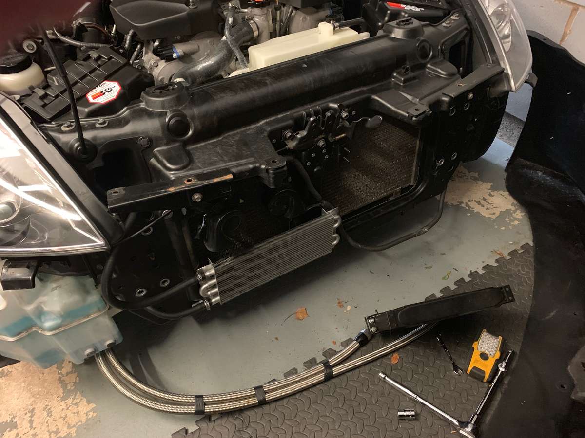
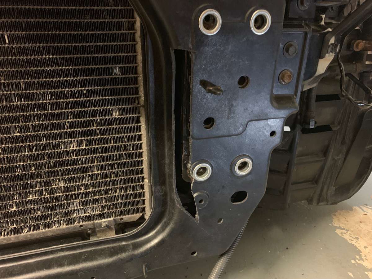
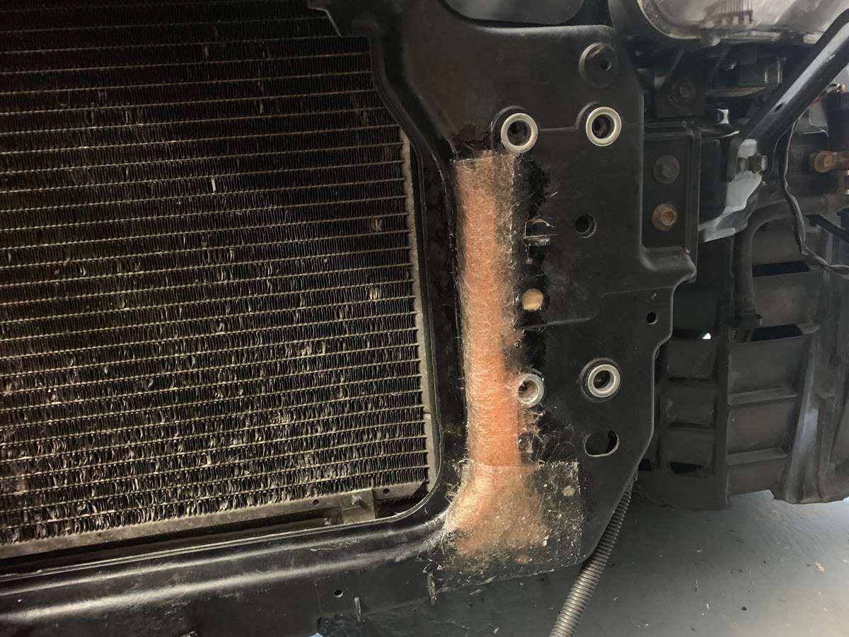
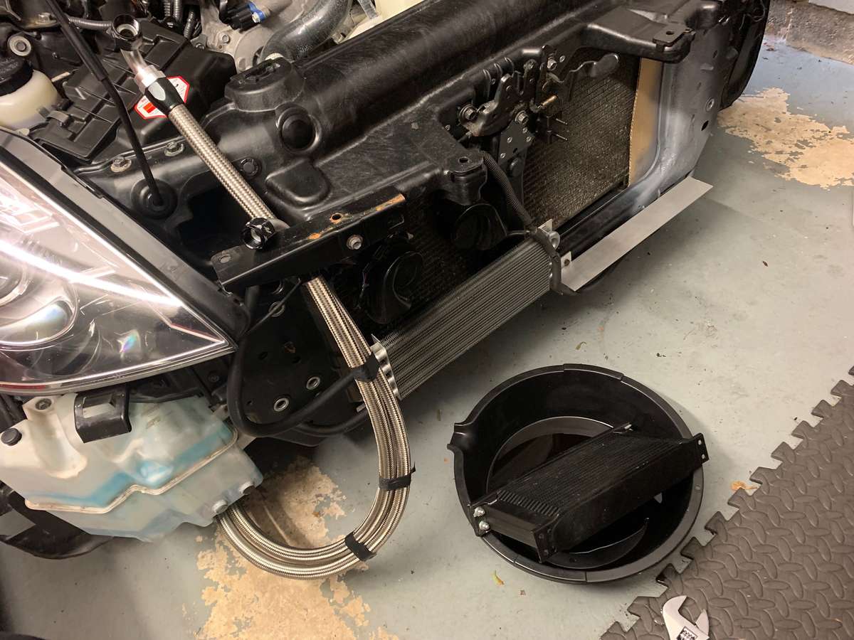
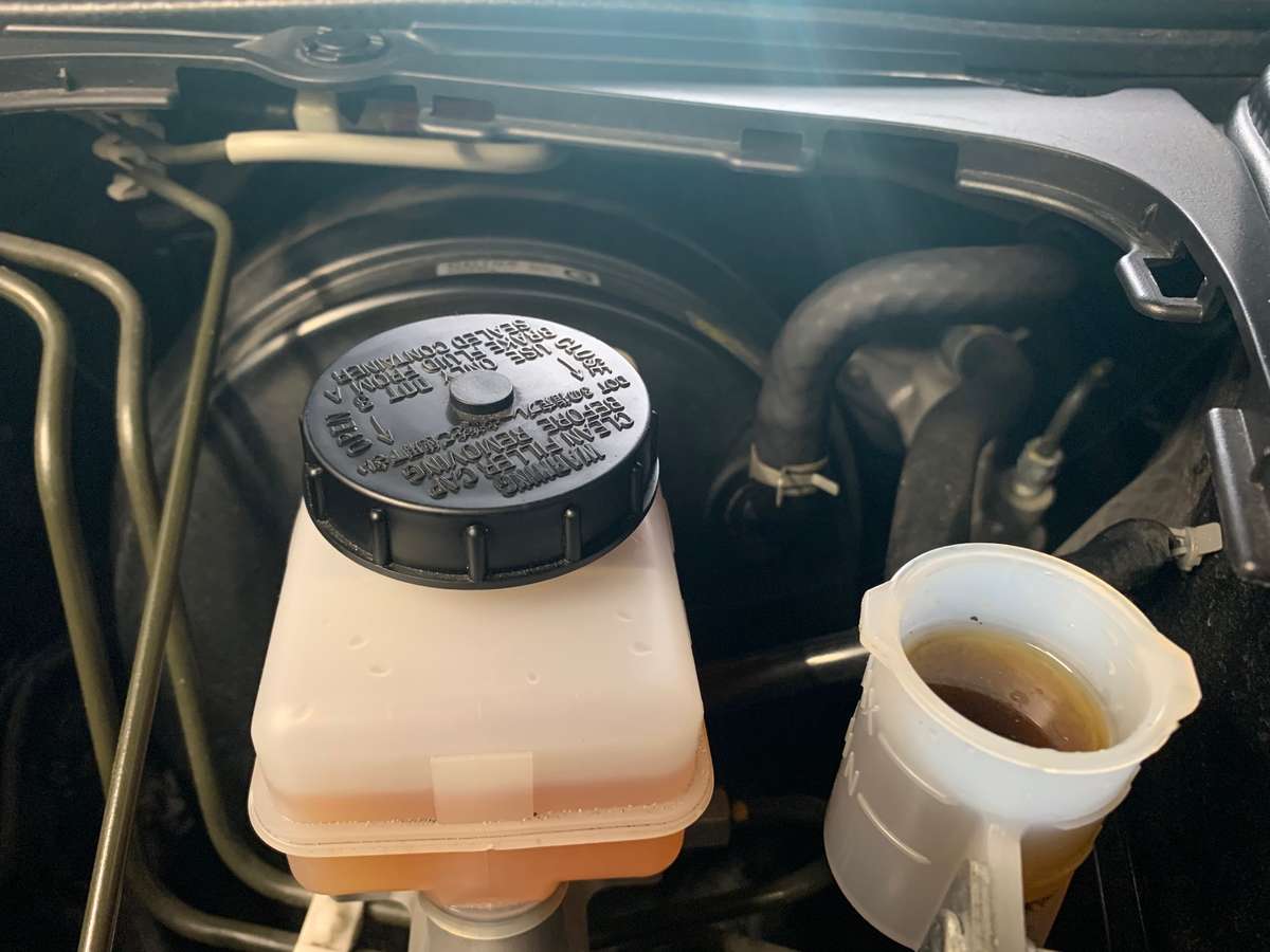
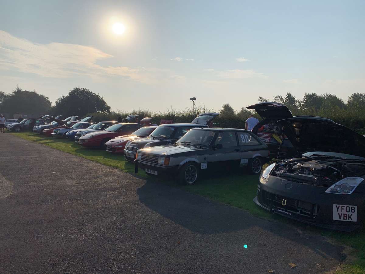
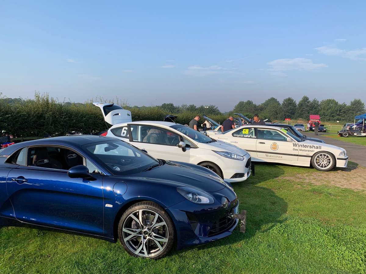
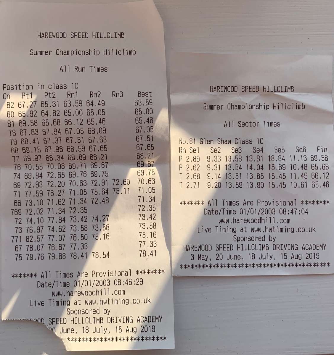
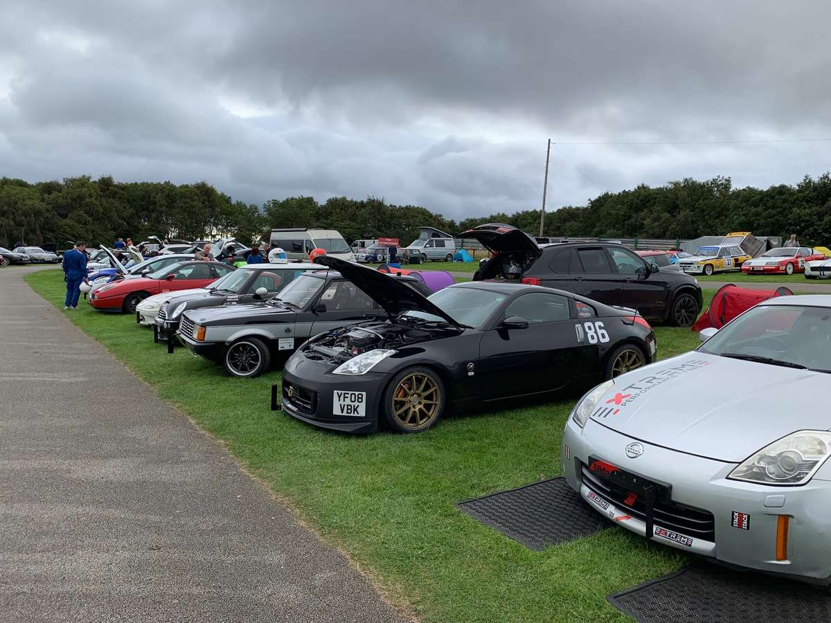
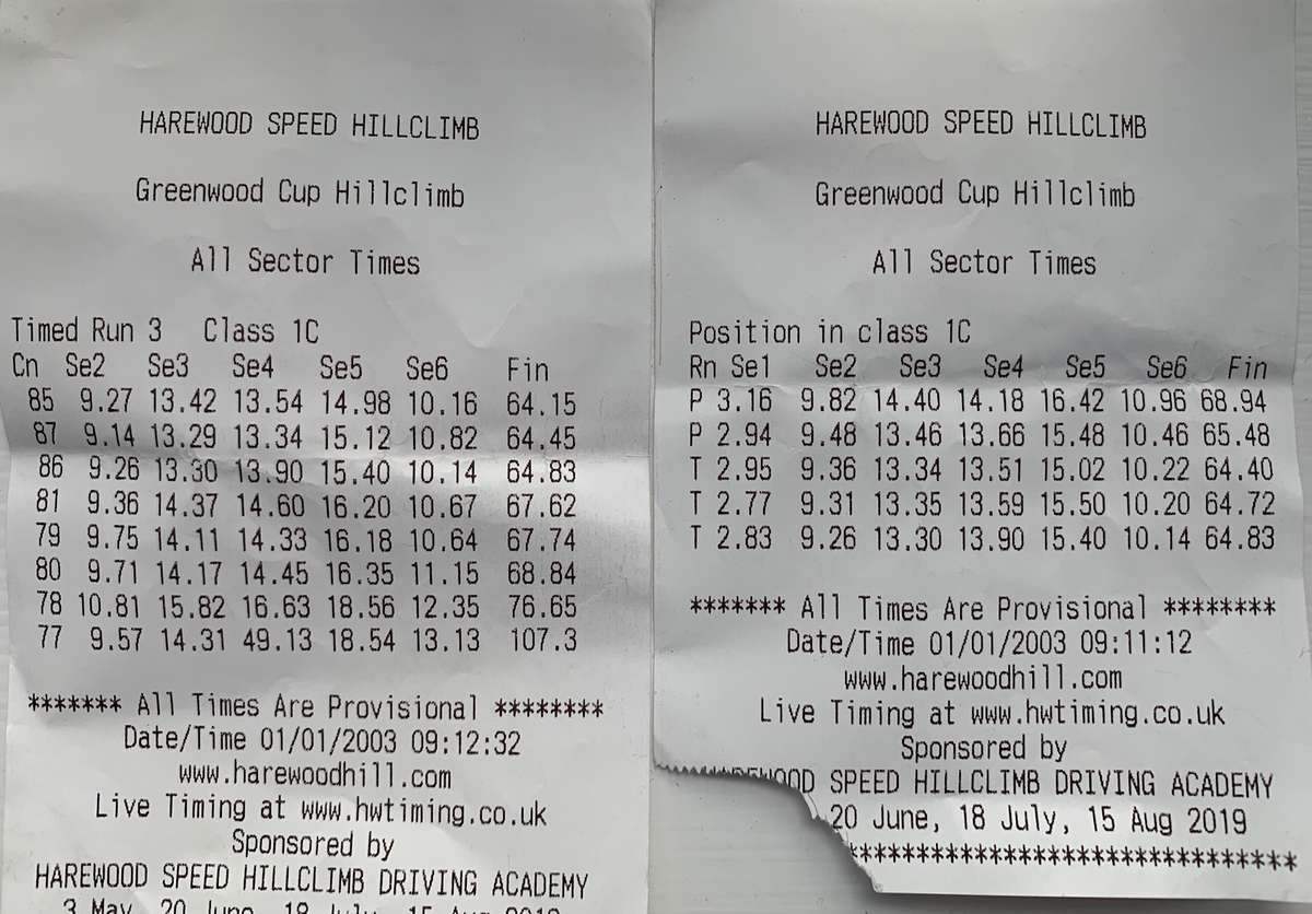
Right then peeps, sit down and buckle up. If you can't buckle up then for christs sake fit some seatbelts on your sofas, do you not take health and safety seriously?? We have a bumper double bill in store for you: So next up as mentioned was the JPS show in Coventry. Now I didn't take any pics but some of you will have already seen I did make a short video of the show and I do have a picture of my Zed ready to go in the morning after waking up the neighbours at 5:30 Freshly waxed but the front bumper is gonna have to wait until the winter to get painted/wrapped. It was great to meet up with the forum massive once again and some new faces as well. Great selection of Zeds on the group stand although as someone said, the 350s are starting to get thin on the ground now some of them are 16/17 years old! Video below: Next up was another Hillclimb round at the end of August and I needed to really fix the front damage again for the second time. Now at this point, even though I had been massively understating the cost of parts to the other half, even she was beginning to add them all up and several £20 and £30 still run into hundreds that in her mind could be (lets put this diplomatically) be better spent elsewhere. With this in mind and to try and score some brownie points I said I would fix it myself so I took the front indestructible bumper off (this thing is worth its weight in polyurethane!) and was greeted with this: I did not want to take the main rad support off again as 1- its a pain, 2- it would mean disconnecting the power steering cooler, 3- there are lots of bolts/clips and I just couldn't be arsed. So I purchased a fibreglass repair kit for £15 and decided to fix it in situ. I also decided to make a new bracket for the oil cooler out of angle iron and bolts lying around, I could re-use the oil cooler lines so only needed to purchase the main oil cooler rad which was around £120. The undertray could be just beaten back into submission for the 4th time, that thing is another lifesaver. So step one: Angle grind out the cracks to leave a nice hole to fix: Step Two- put some cardboard behind said hole and start filling with fibreglass matting and resin. Word of caution to anyone thinking of taking on something like this, do not mix anywhere like the amount of hardener you think you'll need in with the resin. I think the instructions said something like a pea size amount of hardener per 10ml resin and it gives you 5mins of working time. Well I think I was working to mushy peas rather than garden peas as it went off in around half that time, so I only had chance to do 4 layers of matting, still enough to do the job and seems strong enough to hold: Then the good old rattle cans came out, just anything I had lying around in the garage, some grey plastic primer first and in between coats I was "fabricating" a new oil cooler bracket and working out how it can be fixed and secured to the rad support: I then unscrewed the oil cooler pipes at height so the oil would stay in them meaning I would lose very little oil, just what was inside the battered rad. New rad fitted and I went for a silver one this time to match, well sort of match the power steering rad so it looks much cooler from the front when you look through the gaping mouth of the bumper. I had some kuro black spray paint so this went over the grey primer to blend in. To do a proper job it should have been filled and sanded but as its for the most part unseen I'm not that bothered, plus knowing me it will be wrecked again shortly, in hindsight I should have repaired the first one and saved £150 cough cough, sorry wife, I meant should have saved the £30. Whilst I had the car in service mode and after recently bleeding the brakes I thought to myself, wonder how that 6 month old clutch fluid is doing, well, not to well... recent brake fluid on the left, clutch on the right, both RBF660 so not wanting to start another "why wont my clutch bleed" type thread I just syringed out as much "old" fluid as I could using the son's calpol syringe and filled back up with fresh, what difference it will make I don't know but it looks orange again in the reservoir so that's good enough for now. They say prevention is cheaper than the cure so I have bought some volcanic rock heat wrap stuff to fit during the winter. I think the root cause is the unshielded high flow cats are getting so hot when I am waiting to race and during racing that its partly cooking the fluids even with high temp stuff. If anyone can chip in if its safe to heatwrap sports cats or which section would be best to heatwrap than please chip in. The joblist for winter is starting to grow as I now have warp speed indicator blinking again so either the resistors behind the rear bumper have packed in or somethings come loose, either way I need to take the rear bumper off and sort out. So onto the hillclimbing: round 7 and we had a lovely day for it, this was the early morning shots: Yes, A lovely Renault Alpine A110 had come to have a go. The mature owner had only had it a month and just come back from a 2000 mile trip round Europe so needless to say, he didn't trouble the top of the leaderboard understandibly but it did get a lot of attention throughout the day. Bit of a frustrating day for me as braking wasn't the best yet again. I think in hindsight this was in part due to the 2 year old nankangs being well past their best and then me putting standard pads back on thinking they were the issue so the last 2 sectors I was losing chunks of time meaning my best time of 65.46 was well down on similar conditions from previous year. something needed doing but what.... In the 3 weeks between round 7 and the double header of this weekend (rounds 8 & 9) the wife decided to sell her Fiat 500X and buy a mini. She has always wanted one ever since passing her test ages ago and now has convinced herself is the perfect time to get one. I did try to twist her arm to get a supercharged one but I had to settle for the 120hp Cooper model. It is a nice low mileage example and being the car enthusiast I am, after she had pestered long enough I agreed and gave it a thorough clean and protection. I also took the opertunity to video it with the iPhone so if you literally want to stick pins in your eyelids for 30 minutes and you are that dull that there is nothing else you can do in the 30 minutes then watch away. Fast forward to this weekend and we had a double header at Harewood to finish the season. In a last ditch attempt to get back into the 64's I went and purchased a set of Extreme tyres. Now most of you reading will not know or have heard about these tyres and why would you. They are ex rally remould tyres from Poland/Germany available in a range of compounds to suit sprints/track days/rallying. The benefit is they are fairly cheap, around £100 each for 18" and they are road legal, the drawbacks are they wouldn't last 2 minutes on the road and they chew up very easy if they overheat, the quality is very dubious also but it seems everyone at the top of each class is using them so as the old saying goes, If you cant beat them, Cheat. or it could be join them, I never can quite remember. Anyway I decided to be a sheep and follow everyone else, Saturday was a nice relatively warm sunny day which resulted in: All 3 timed runs in the 64's The grip these things give you and the confidence to thrown it round corners is incredible. I have said this before and will just stress again, now wonder F1 spends hours debating tyres, almost a second quicker just chucking on a new set and in T1 beat my PB by 3 tengths. I honestly thought I was on for a 63 but excitement got the better of me and a mistake in the next 2 runs cost me half a second each time. I wwas on for the win as well but Terry in the Talbot pipped me on the last run to snatch victory away (he too set a new PB on Extremes) @Kieran O'Quick had an unusual off day and problems/errors meant he finished behind Me and Terry. Just for info I have the soft R5 compound on the rears and the medium R7 compound on the fronts, to stress the unusual quality the 255 fronts and 265 rears are exactly the same width, when you offer them up side by side or stack them laying flat they are identical, im not sure if the seating part is different as they seem to fit the different width wheels I have fine. To give you an idea of how "soft" they are, I travelled to the event in them, around 20 miles cruising on the motorway at 60mph as I had issues with the wet tyre offering from them overheating on the motorway if you recall. I arrived at harewood around 7:30, the grass was wet and when I parked up the rear tyres were steaming, they were very hot to the touch and burning off the moisture from the ground so again, I would not recommend them for a daily car unless you got the hard compound. Onto Today (Sunday) and to quote another quote, "what a difference a day makes" From the dizzy heights of a PB and regular 64's we arrived today to find that what the british weather gaves us in one hand, they now taketh away in the other. fairly cold, windy and rain in the air, although not forecast till the afternoon, it was looking bleak all day. The tyres, even the softs could not switch on until the latter part of the run meaning everyone was complaining about poor starts and lack of grip. There were several first turn incidents including Julian in our class in his MX5 who never managed to record a time. Jonathan who was 2nd in the championship had major problems and didn't get to record a time and lots of people had offs probably due to a number of factors but the colder conditions definitely didn't help. My times were consistently in the low 65's but I just couldn't get a 64. Terry was in the exact same boat and we were posting almost identical times all day. I finally finished 0.05 secs in front of him but we were both frustrated. Kieran grabbed the win again after he must have been up all night crying at both not getting a trophy Saturday and blowing the chance of a top 3 finish in the Championship, he ultimately finished 5th so will get a trophy at the awards night. Myself and Terry after a season long battle ultimately finished just outside the top 10 in 14th and 12th respectively but still not a bad showing, gonna have a long think about what to do for next season to get into the elusive top 10, maybe new cams??? Final leaderboard below out of 164 championship contenders: harewood championship 150919.pdf Video below of my best run today 65.07 good enough for 2nd (again) worth noting I got 4 new sector PBs yesterday so my best virtual time is 63.6 whilst that may be unrealistic I think on a perfect day (bright sunshine to heat the tarmac but low air temps for higher power) a 63 something just may be possible. Apologies for noise, I need to get a better camera, I'm not sure where it picks the rattling up from as it doesn't seem to move, need to find a better setup. the camera did not work either yesterday so havn't got my new PB run which is gutting as well: Well, that concludes this months edition and what have we learnt? 1- Don't use too much hardner when using a fibreglass repair kit 2- Lying to the other half about spending will still come back to bite you. (although it will prolong the solicitors letter) 3- Extreme tyres are better for hillclimbing than anything else (although that's all you can use them for) 4- I will never be a youtube sensation (or even a voiceover guy) Until next time...
- 269 replies
-
- 5
-
-
- waxandshine
- hillclimb
- (and 2 more)